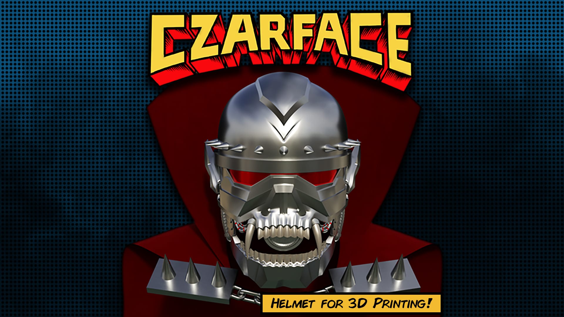
Another commission job down! This one was a real pleasure to work on. Czarface is a hip hop supergroup that occasionally crossed over with the late, great MF DOOM. Like DOOM, they adopted some comic book style, and the Czarface character is representative of the group as a whole. They’re supported by the fantastic art of LAmour Supreme, who has rendered the character out in a number of different styles for album covers, music videos, and a lot of other appearances. As a result, there’s a lot of source material to work with for this character.
The challenge with a project like this is actually that there IS so much source material, and a lot of it is in wildly different styles. You’ve got interpretations that resemble a golden-age cartoon Iron Man, and others that go for a much darker, gritty take. Some visual themes remain consistent – things like the fangs and the mohawk, for instance – but most of the other details are up to the artist’s interpretation.
After doing some digging, I found an image on the cover of the LP for The Odd Czar Against Us! and felt like the head design pictured on it was a good starting point. After showing the client, he came up with an even better image – from a tote bag on Czarface’s web store, of all things.
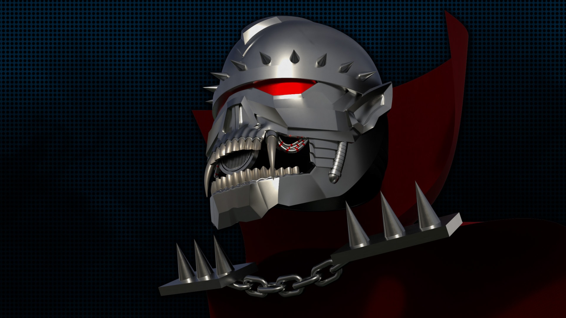
Perfect. I dragged this into 3D Studio Max as a reference and started doing some low-poly modeling work to rough out the forms I’d need to make this work. I took a few liberties with the design as I went in order to make sure it’d be a wearable model, but I tried to stick to the overall themes. Here’s an interactive look at the low-poly draft I provided to the client:
Making a low-poly model is easy enough, but you’ve also got to think about how the finished model is going to come together. I had been sizing the helmet around a rough 3D scan I had of my own head, but I realized pretty early on that it’d be tricky to get the thing on and off if you had a big, dumb skull like I do. After some discussion with the client, we agreed to try a design with a removable back panel, similar to what the Marvel Legends helmets have on their Ant Man and Iron Man helmets.
I did find the back a bit puzzling, as I couldn’t really track down many images of Czarface from behind that didn’t have his gigantic cape obscuring most of the details I wanted to see. I ended up doing the ol’ zoom-and-enhance on a few cover images I could find. I also referenced the design of the Czarface toy(s) that existed to get an idea of what should be on the back.
I played around with a bunch of different options – segmented paneling, a smooth option – but what we ultimately settled on was a ribbed design at the bottom of the back panel, on the theory that the character’s neck was probably segmented like the arm armor was and this option continued that theme up from the shoulders.
As I worked my way through the process of taking my low-poly draft and making it a higher-resolution model, I found myself continuing to worry about the scale and fit of the helmet. I really didn’t want to end up with an oversized bobble-head look, but it’s sometimes hard to gauge these things in a virtual environment. Since the client for this project had their own 3D printer, I was able to slice up a small section of the helmet and send it to them as a test print. I also printed one of these minimalist versions for myself to see how it’d fit over my lightbulb of a head.
I got some helpful images back from the client that I was able to use to slim the helmet size down a bit more, which he has generously given me permission to post. Really glad we did that test print, actually! I wanted to leave enough room inside the helmet so that you could include padding, but not so much that the proportions looked goofy. Worst case, I wanted to leave room for weather stripping, but I imagine you could come up with something more robust.
After some tweaks to the helmet scale, it was time to smooth everything down on the inside of the mask. I hauled the parts I needed into ZBrush and booleaned everything together, then isolated just the inside faces of the mask and softened everything down. This helped thin out some areas of the model that I thought were a bit too thick, and let me make a little bit of extra room for the wearer’s nose on the inside of the mask. One important design change was to replace the previous red visor shape with a cut-out ledge right above the nose – I wanted to be able to fit a simple curved plane in that spot instead.
There are a few reasons for this:
- Transparent 3D prints suck to look through. Even if you find red clear filament and print the visor, you’ll still have print lines to deal with.
- Instead of trying to print the red part of the visor, this design makes it so you can find existing red sheet plastic, cut it to size, bend it, and glue it to the inside of the helmet. Or get thin clear plastic and apply a red tint to it, like brake light tint film.
- By leaving the lip on the inside of the mask, you’ve got something to register the bottom edge of the visor piece against.
The back panel of the helmet was a bit of a bear to figure out when it came to the final design. While I really like the elegant design of the Marvel Legends helmets, they rely in part on the ability of ABS plastic to flex and bend. I wanted to make something that would be easy to 3D print without having ridiculous tolerances or hardware requirements. I ended up going for a design that primarily relied on magnets to hold the back panel in place; each side of the panel has tabs that slot into recessed channels on the main mask piece, and both the tabs and the slots have cutouts for a set of 20mm x 10mm x 2mm rectangular magnets.
I was nervous that the tabs and magnets wouldn’t be enough to hold the back panel in place. I could imagine the panel falling off if the wearer did something like look straight up, which would push their neck against the back lip of that panel and might be enough to overcome the force of the magnets in the side tabs. I added some small receivers on the back of the helmet that would accept circular magnets that were 6mm in diameter and 3mm tall. As a last measure, I cut away a 1″ wide channel on the inside of the back of the helmet that bridged across the back panel and the top dome. This channel was included so you could potentially attach a strip of elastic between the pieces (with hot glue, or E6000 adhesive maybe). My thinking was this elastic would help secure the panel, and also be a catch-of-last-resort if the panel got knocked off somehow.
I sectioned the rest of the helmet up to try and simplify the printing process a bit. The bottom jaw got cut off and I added registration tabs for both parts. I also cut away the long fans on the top jaw and added plugs and sockets to both, since I imagined those parts might be tricky to print as a whole.
The grille inside the mouth got a detailing pass. It has a set of holes that match up with corresponding holes on the inside of the mask so you can screw it on. The idea was that I figured the part should be optional or removable, as I wasn’t sure if it’d be annoying for a wearer to have in front of their mouth.
I made some tweaks to the spike mounts on the top of the head for sanity’s sake. The spikes are all identical with holes in the back that match up with the holes through the helmet. Again, the hope was that they’d be easy to attach with screws from the inside of the helmet. The ears were modeled to come off as separate parts, and are cut away on the inside to slot up against the matching profiles on the mask’s exterior.
Here’s an exploded view of the helmet parts we ended up with:
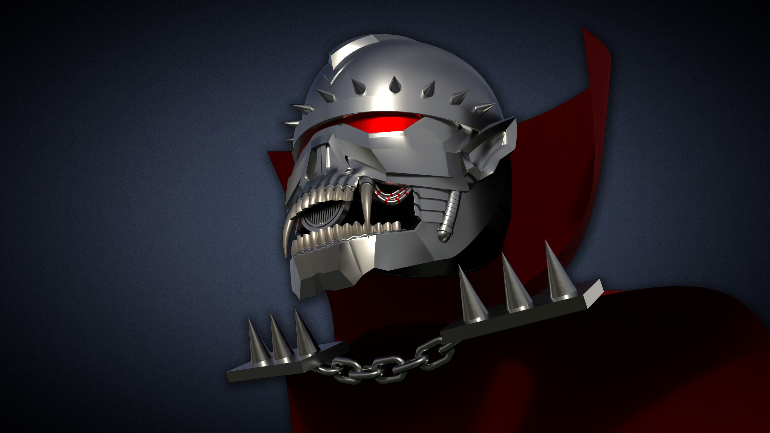
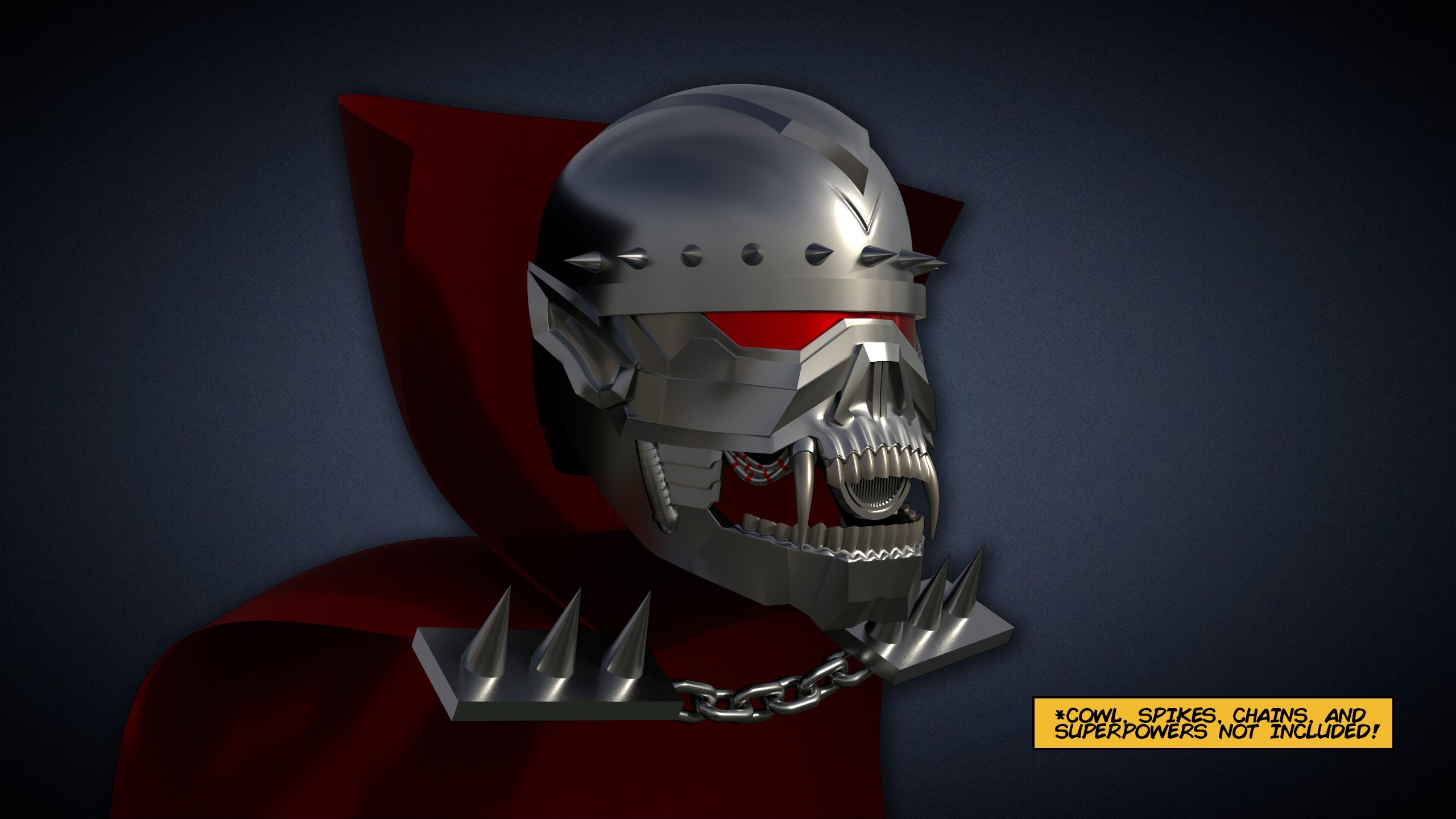
I started printing one of these helmets to add to my own collection, but I had to take a trip out-of-town for a few days which has slowed me down a bit. Thankfully, my client beat me to the punch and printed the whole thing in record time, and sent me some awesome photos of their finished product!
Here’s hoping I’ll get the chance to work on the rest of this character’s costume in future!
Comments (1)
Hey is this helmet for sale or anything? I love the design and I’m just wondering if this is a product of yours